Data Analysis
The eProtein Discovery instrument will show, at the end of the experiment, the four best obtainable combinations of eGene™ construct and Cell-free Blend.
 At the end of the experiment a report folder is generate and it containining all the raw data and other information that can be used by the Nuclera Technical Support team for troubleshooting purposes.
The instrument should not be switched off until the [Donwload Report] button becomes available on the eProtein Discovery Cloud Software.
The experiment report folder contains:
- Experiment video
The video should be watched to ensure the correct operation of the instrument and cartridge during the experiment. Any questions or concerns regarding the operation of the droplets should be directed to the Nuclera Technical Support team (techsupport@nuclera.com).
- CSV report file
-
The report file is a csv file saved in the report folder with the name given to the experiment included in the file name. The results for each one of the 30 purified target protein conditions, and the 192 conditions for the produced protein are listed in the csv file. It also contains the measured values for the controls, the expected range for the controls, and a PASS/FAIL score if the measured values are within the expected range.
- Blue light images (TIFF images)
-
Images acquired at the end of expressions and purification. These images can give the user information about the solubility of the protein.
- Other files
-
The folder contains additional files that can be used by the Nuclera Technical Support team for troubleshooting purposes.
Further analysis can be carried out from the eProtein Discovery Cloud Software or using the Excel template if using an eProtein Discovery with standlone settings.
In the tabs below, select the system you have used and it will be shown:
- How to download/eport your report
- how to visualise the data
- Cloud Connected
- Standalone
Once the run is complete the software will instruct the user to remove the cartridge and waste Base Fluid from the instrument to prepare the system of the next run.
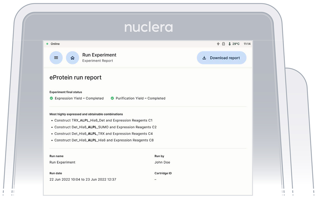
The “Results”, “Scale-up Data” and “Data Analytics” tabs will now be visible. Within the Results tab you will find:
- Details of user, date of run completion and cartridge ID.
- The best combinations for top purification yield.
- Quality controls with warnings if outside of expected ranges. Please contact support if there are warnings.
- 88 purification and expression yields
- Downloadable report containing a video of the run and report.csv file.
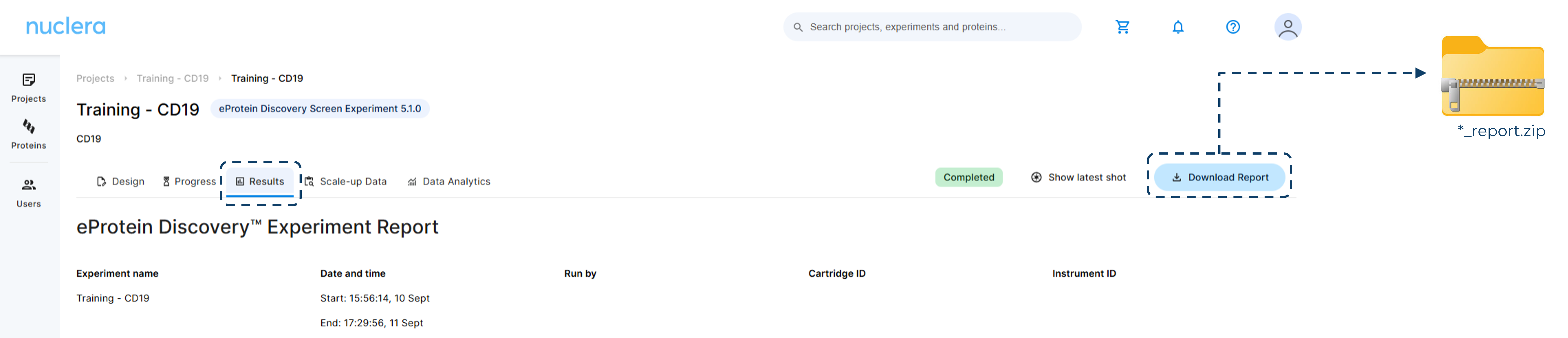
Export the report
Navigate to the cloud Software and from the [Rsults] tab, click on the [Donwload Report] from the top right hand side of the screen.
Data Analytics
The data analytics tab shows expression and purification plots to identify the optimal construct variant(s) and additive blend(s) to take forward to the bench scale up.
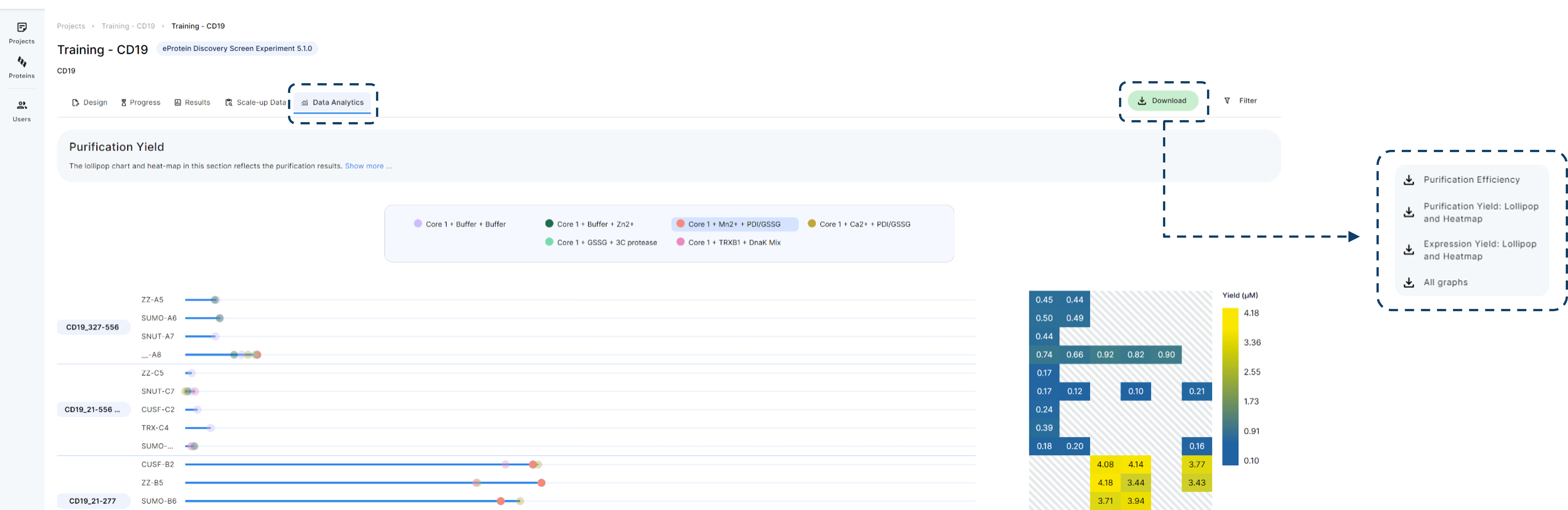
To add/remove proteins, solubility tags and Cell-free Blends from the data analysis graphs or change yield from µM to mg/mL use “Filter”. Don’t forget to press “Apply”.
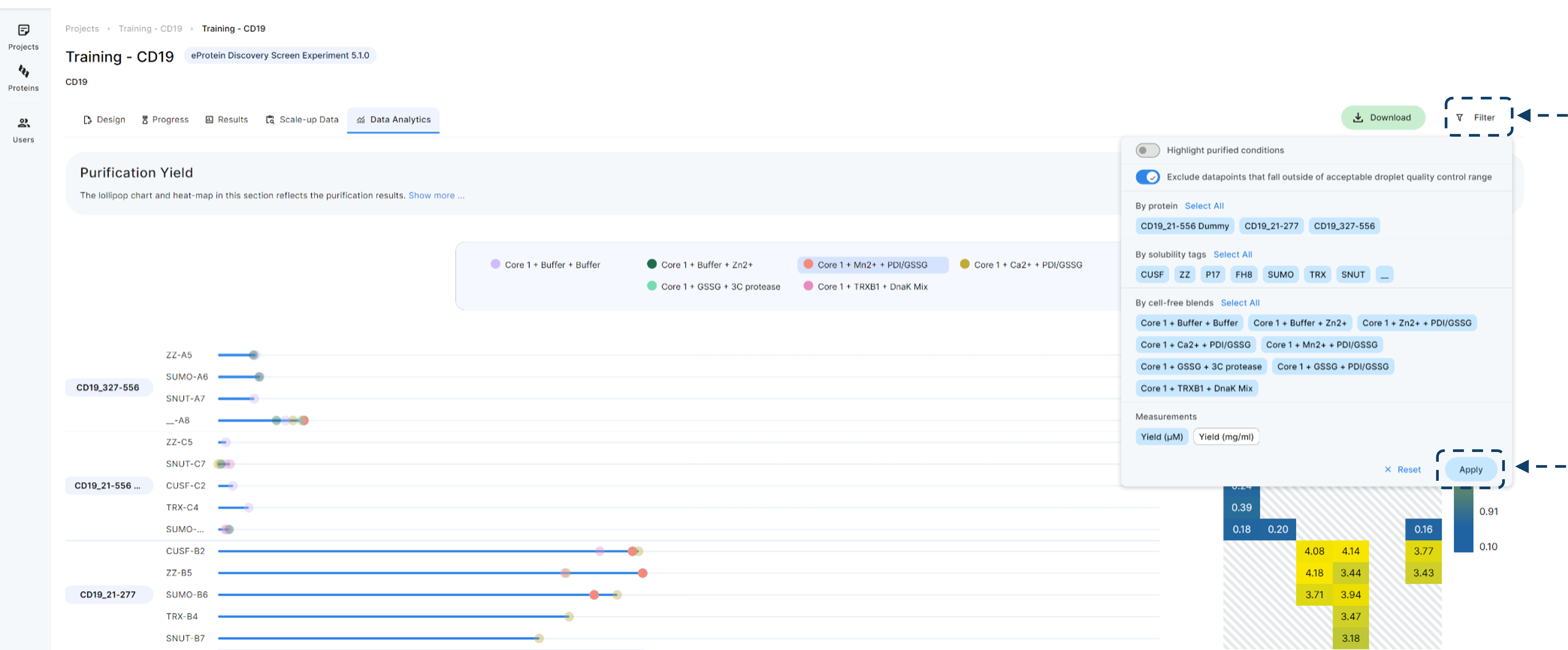
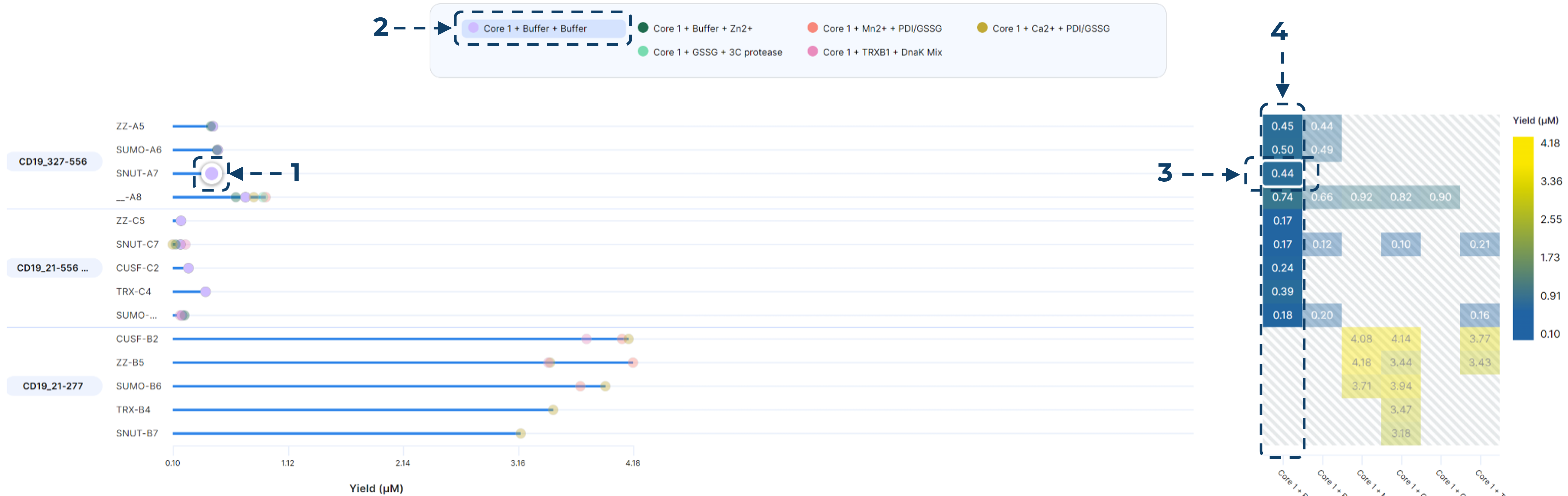
Data Analytics - Purification Yield plot
The Purification Yield plot display your target protein yields relative to the specific Cell-Free Blends (CFB), which are indicated at the top of each graph. For a comprehensive data review, both Lollipop and Heatmap visualizations are available for analysis
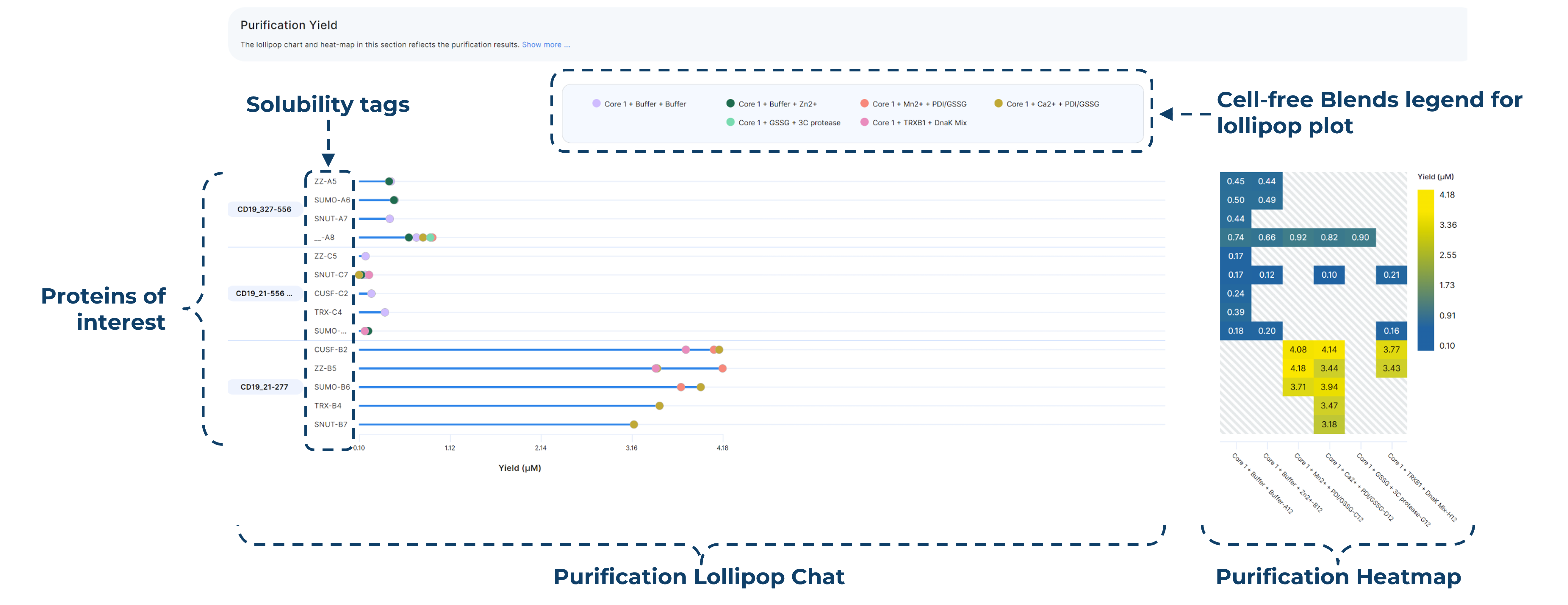
The Purification Plots are fully interactive. By selecting a specific data point on the Lollipop Chart (1) or a Cell-Free Blend from the top legend (2), the corresponding data points for that blend will be highlighted within the matching Heatmap.
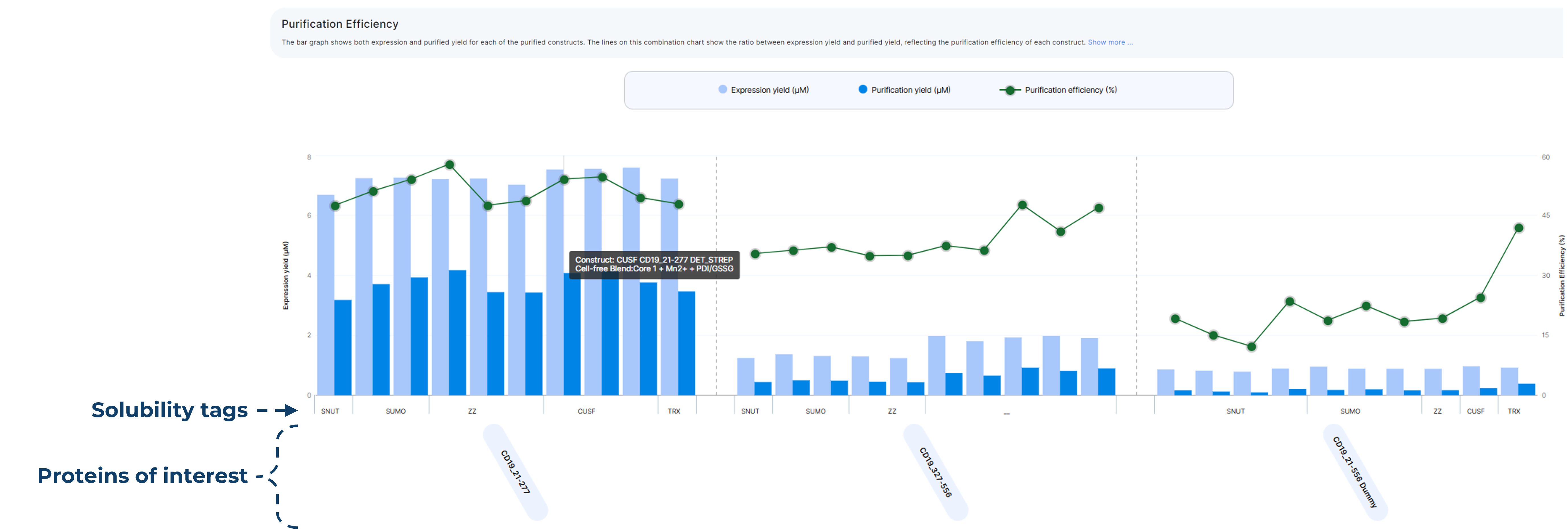
Data Analytics - Purification efficency plot
Purification yield plot provide:
Combined Visualization: These charts utilise a bar and line combination to integrate expression data alongside purification yields.
Efficiency Metrics: The secondary axis displays the % recovery, representing the overall purification efficiency.
Interactive Legend: Simply hover your cursor over any data point on the chart to identify the specific Cell-Free Blend (CFB) and construct associated with that result.
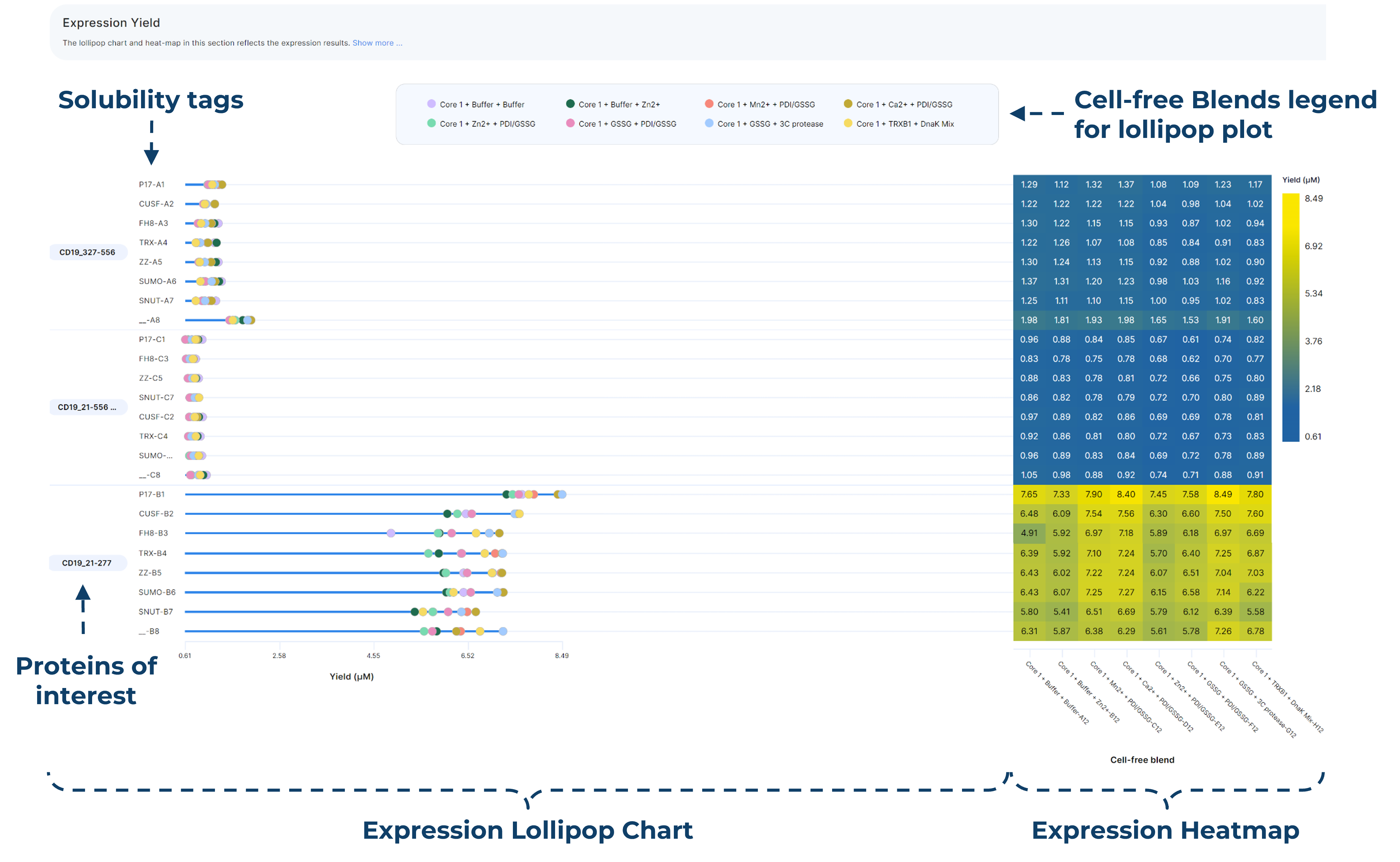
Data Analytics - Expression yield plot
These dynamic expression graphs contain the full 192 data points collected prior to purification and the same dynamic features as purification plots. Heatmaps and Lollipop charts for a full view of expression data.
Scale-up Data - Predicted Yield
The Scale-up Data tab shows the predicted yield that can be obtained from a 200 µL scale-up reaction. Double click on the desired predicted yield bar on the graph to calculate scale-up reaction volumes. The bar graph visualization can be filtered by protein, solubility tag, or cell free blends.
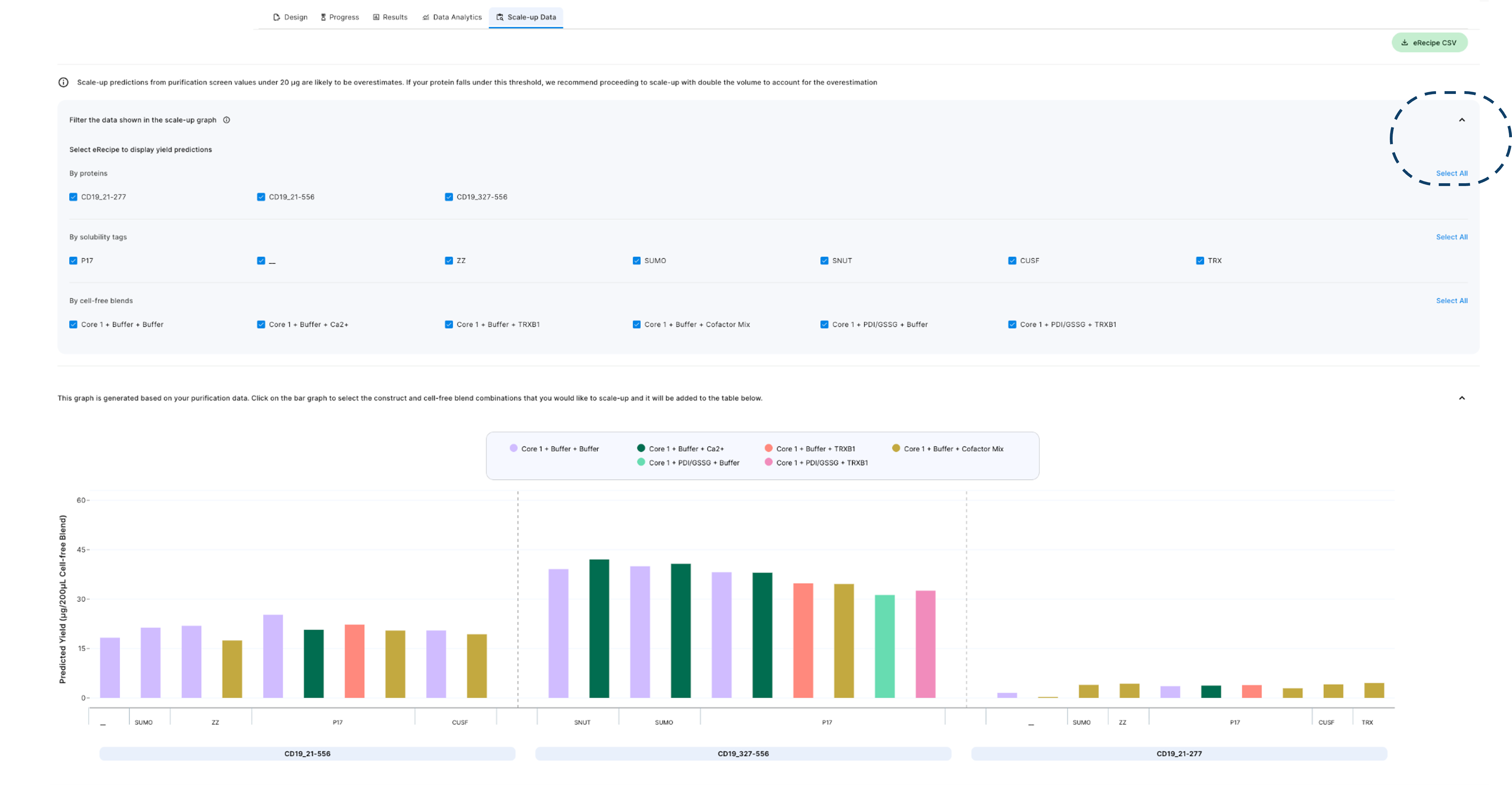
Scale-up Data - Plan the experiment
Selecting the desired bars from the Scale-up plot enables the user to:
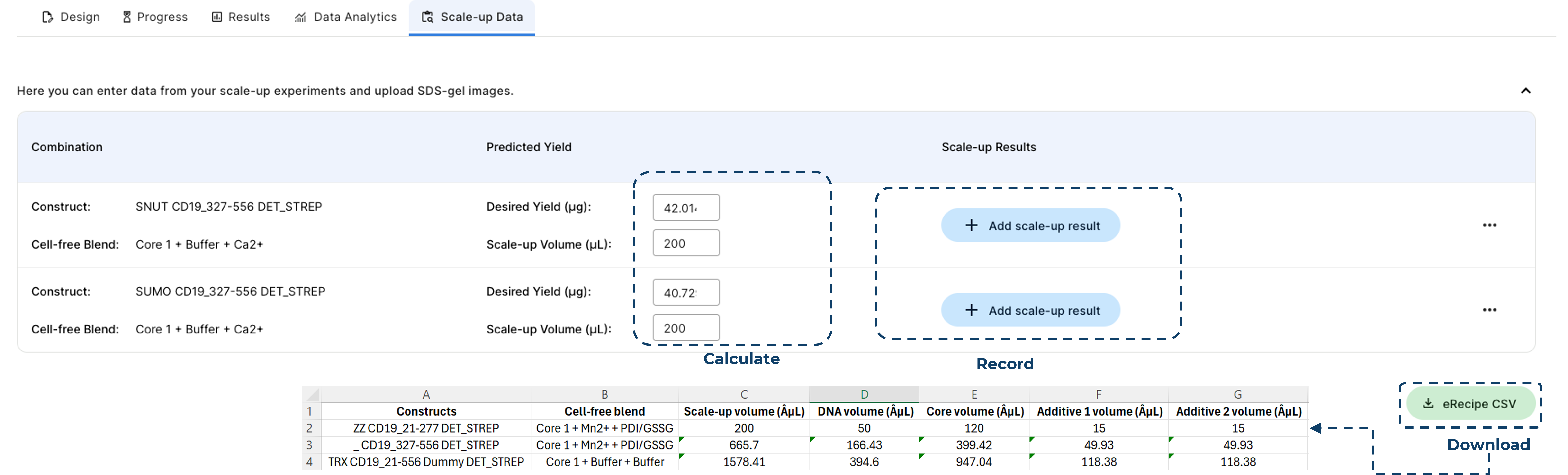
Calculate the volume required to obtain desired protein yield
Download the eRecipe spreadsheet to support setting up Scale-up reactions
Record your purified protein yields and purity
Scale-up Data - Report the results
The Nuclera Cloud Software provides a centralised platform, allowing users to consolidate all data for a screened construct onto a single page.
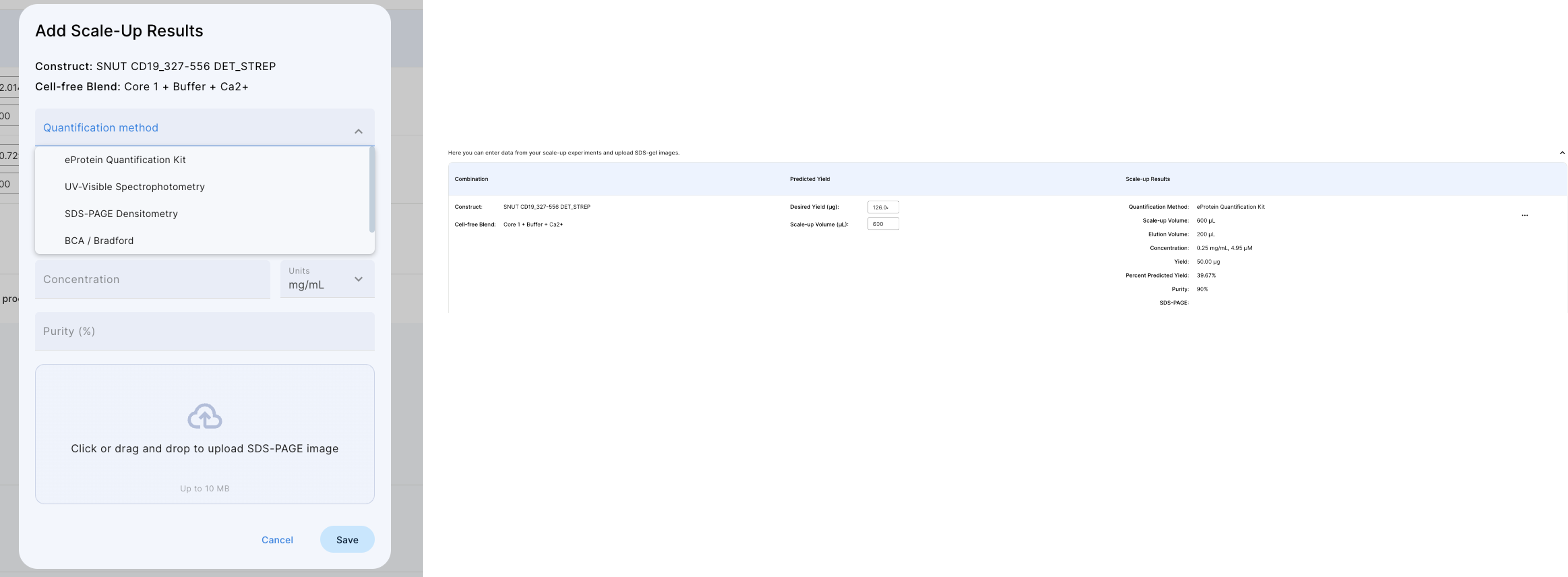
Within the 'Add Scale-Up Results' section, users can record comprehensive information, including actual yield, quantification method, and SDS-PAGE gel images.
Additionally, fields are provided for scale-up and elution volumes, as well as final protein concentration and purity metrics.
Export the report
To extarct data from the instrument after the experiment is completed you can export it to a USB key or using a direct connection to a laptop. You can consult our guidelines for standalone sofwtare for guidance on how to extract the result folder
USB
To export data to a USB flash drive it required to have a company-approved USB flash drive for data transfer. Encrypted flash drives are not currently supported.
Insert the flash drive on the right hand side of the instrument in the USB port. This will highlight the flashdrive icon on the screen.
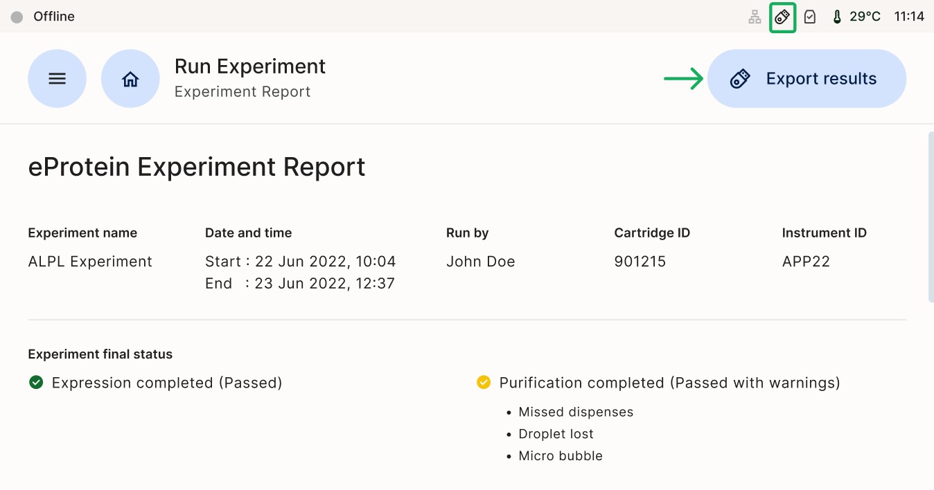
Click on [Export Results]
A selection Window will show the two options available. Select (a) USB drive and click on (b) Export in the next window as shown in figure below.
(a)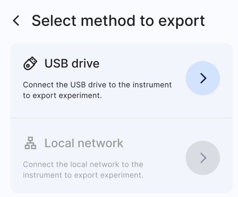 (b)
(b)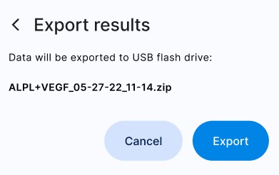
Data is retrieved from the instrument by inserting a USB flash drive into the instrument and exporting the data onto it, then inserting it into a Windows laptop and using an Excel spreadsheet to analyze the data. For data visualization and analysis, it is required to have a laptop with Microsoft Excel
LAN and Local Laptop
Connect an Ethernet cable directly from the instrument's Ethernet port to the Windows laptop (or to the Ethernet-to-USB dongle).
On the instrument:
Check that the LAN icon is no longer greyed-out.
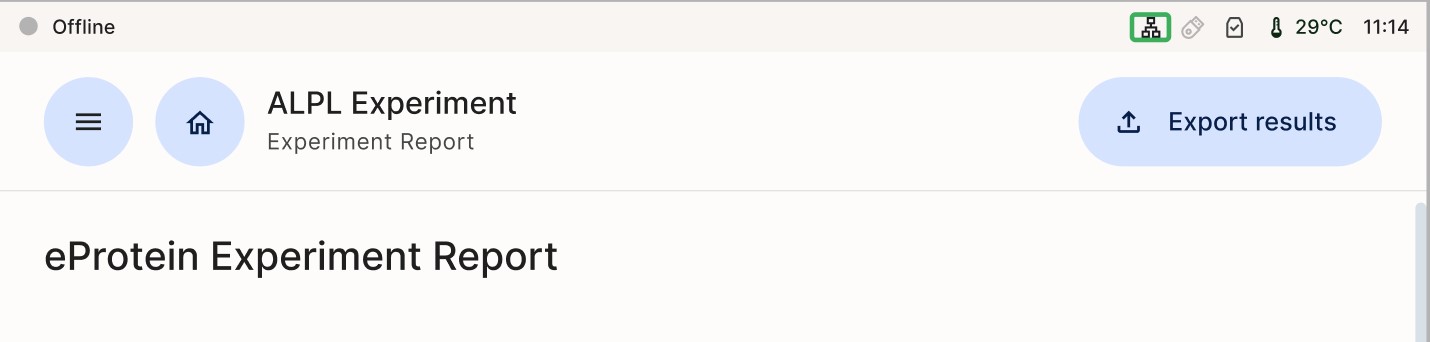
Open a completed experiment and tap the “Export results” button.
Tap (a) "Local network" and enter the following (b):
- URL: smb://192.168.1.100/eProteinReports
- Username: the name of the Windows user that has access to the shared directory, if this is a domain user then the username should be of the form DOMAINNAME\username
- Password: the password of the Windows user that has access to the shared directory
(a) 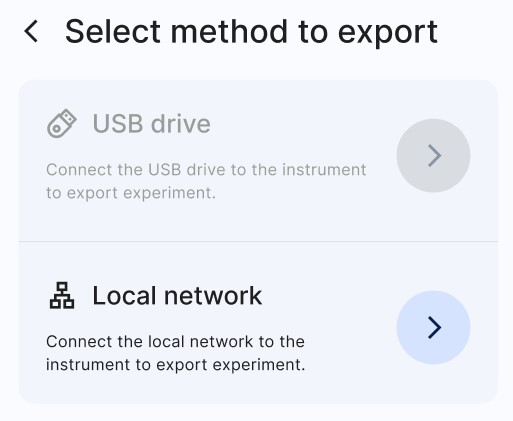 (b)
(b) 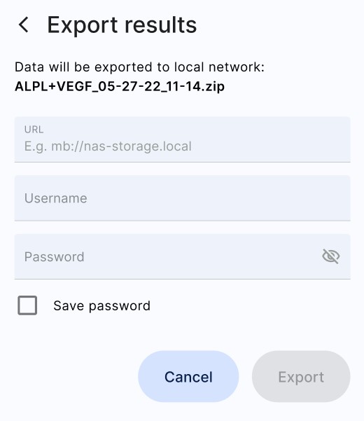
Visualise Data
Using the same Excel template employed during the design phase of your experiment, please follow the steps outlined below.
It is crucial to use this specific template, as the port positioning corresponds directly to the DNA and CFB (Cell-Free Blend) configuration used in the eDrop. Furthermore, the calculations are derived from the Molecular Weight (MW) of your specified construct in the Excel file. This ensures the accuracy of your mg/mL concentration and the reliability of your scale-up yield predictions
- Unzip (right click + Extract All) your report folder exported from eProtein Discovery instrument
- Open the report.csv file and select the entire sheet by clicking the top left corner, or by using the shortcut "Ctrl + A" or "Cmd + A".
- Copy the data using the shortcut "Ctrl + C" or "Cmd + C".
- Paste the report in tab "3. Paste Report Here" of the eProtein Discovery Standalone Template (compatible with Microsoft Excel, not compatible with Google Sheet).
- Review the data in the "4. Output" tab and ensure it is correctly labelled with corresponding constructs and cell-free blend labels.
- The labelled data charts will be automatically plotted in the "5. Charts" tab ready for your review.